5 design tips for a more effective real estate website
Written by a la mode on April 30, 2014
Here's a post from our blog for real estate agents (which you can find here). Since this great advice about websites in general and so many appraisers are also agents, we're sharing it.
……
I’ve worked for a la mode for seven years now. During that time I’ve been a technician, an MLS coordinator, a coach, an instructor, and a web designer. I also had ten years of freelance web design experience prior to that. Wearing multiple hats and speaking to lots of different people helps with perspective in a big way. To cut to the chase, here are five core things I’ve learned over the years that can help make someone’s life much easier while trying to build the best site possible.
1. Before you do anything, set up a three-pronged plan
During my time as a freelance web designer, I was asked to work on websites for many different people. In many cases I’d have no idea what made that person’s audience tick. Many of my contemporaries in the industry were in the same boat, but would just default to building a website as if it were an “online business card.”
That might have been fine back when the Internet was a quieter place. However, I knew a website could be so much more than just your “place to exist” on the web. I wanted to make websites that actually engaged people, generated new business, or served as a great resource for their current and past clients. Basically, I wanted a website to actually “do something.” So, I came up with a short, clear way to get on the same page with someone before I built them a website that generated results.
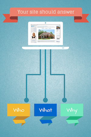
I’ve carried the plan I used back then into the classes I teach now (you can find these at www.alamode.com/agenttraining), and the approach is quick and simple. I’d ask my clients three questions (the “who”, “what”, and “why” of web design) and we’d go over them until I knew enough to get started.
- “Who are you targeting?” Make a list so you know who you’ll be “talking to” with your content. Be specific if possible. This helps us concentrate on who we’ll target. For example: Homebuyers in Naples, Florida.
- “What do these targets want from you?” Each audience needs to see something just for them as soon as they arrive on your site. If not, they’ll leave. List some specific things for each of the targets you mentioned on question #1. These will be the pages your site needs to have. Example: an “Info for Buyers” page with relevant content.
- “Why should they contact you now?” It’s not enough to give visitors “free” content like listings or advice articles. You also have to ask them to do something such as leave feedback, sign up for a newsletter, request info on a listing, download a neighborhood report, etc. If you don’t ask them to do something, they’ll stay passive and you may never hear from them. But if you ask – and you ask interestingly enough – they should start the conversation.

2. Keep design simple with important elements “above the fold”
In the newspaper world, there’s a concept called “above the fold.” Editors use it to make sure that when their paper is lying folded at the newsstand it still looks interesting enough to get picked up. The goal is for the headline and most interesting photo to show on the upper half of the first page (just before the fold line). They plan their whole layout around this for the biggest impact.
In web design, the “fold line” is where the content gets cut off at the bottom of a given screen (whether that’s a desktop, laptop, or mobile device). Keep your most important elements high, to avoid someone having to scroll down to see it.
You also want to avoid sensory overload. If your site has 30 pictures, links, forms, and graphics all fighting for someone’s attention, none of them will win. Your visitor won’t know what to do, and they’ll be gone faster than a plate of warm cookies at an open house for a certain furry blue monster. Make sure you have enough white space on your site. Give important elements room to breathe. You don’t have to pack every page with every possible thing you might want a potential client to see.
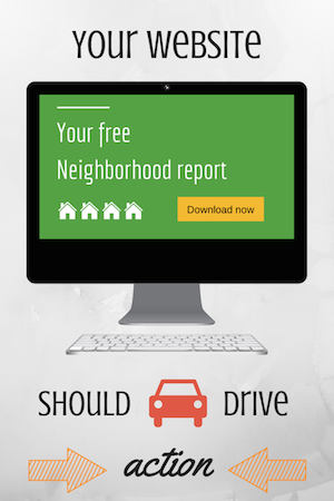
3. Make decisions that “drive action”
Speaking of keeping it simple, there are some things you may want to consider for the chopping block. Try to only use things that pique someone’s interest. Your homepage shouldn’t be an online business card. It shouldn’t be a bio. It should engage someone on the subject of their choosing (not “how great you are”) and then offer something that drives them to action.
When picking your content, choose topics that demonstrate to someone that they’re ready for you, like a checklist or advice that specifically handles getting prepared for their transaction. Pick things that remove obstacles that may otherwise keep them from working with you (like securing financing, etc.). Generic pages that don’t drive action, don’t capture leads.
Offering your site visitors something of genuine value in exchange for their contact information is a great way to capture leads and start off on the right foot.
4. Don’t worry about keeping up with The Jones’s
When you’re trying to “enhance” your website with things you’ve seen someone else do, keep your end goal in mind. Sure, you can add a widget for local weather to every page of your site. But, is it worth the time and effort? Just because you’ve seen it on someone else’s site doesn’t mean it works. Content, marketing, and offerings are far better places to spend your time. Only do things to your site if they have proven their effectiveness to you.
If you find yourself burning lots of time worrying about things like cosmetics then there’s also no harm in going low tech. Having a plain text link on a page that says “Find out the true value of your home here” can technically get a visitor’s attention the same as a fancy, animated banner that says the same thing. It won’t take you hours or the paid services of a graphic designer to achieve it, either.
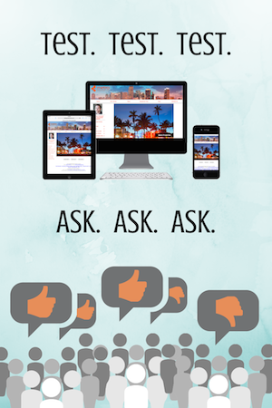
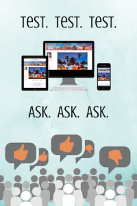
5. Test your site on multiple devices and with multiple colleagues
Just when you think your site is “good enough” you need to get multiple screens and multiple eyes looking at it. Try it out on a phone or a tablet to make sure things display and fit correctly.
When you have a colleague look at your site, ask them to put themselves in the shoes of your target audience. Tell them “pretend you’re a buyer and pick something you want as a buyer. Can you find it easily?” You may think that you did an excellent job but everyone thinks their own baby is cute, right? You need honest feedback because their opinion may mirror a prospective visitor. You don’t have to make each person 100% happy (especially if they nitpick something like your favorite colors or the shirt you wear in your profile photo) but you do have to listen to the big stuff that could hold someone back.
The five tips we just looked at are simple, but effective ways to make sure your real estate website delivers leads by providing your target audience valuable, relevant content that drives action. If you have any questions or give us a call at 1-800-252-6633.
You can also click here to get a free trial of our agent websites.