In TOTAL, you can work with all of your report's comps, rentals, and listings side-by-side in one screen. While other software vendors, like ACI, may claim they have side-by-side comps, it’s clear when you put them to the test that they fall short. Let’s take a look.
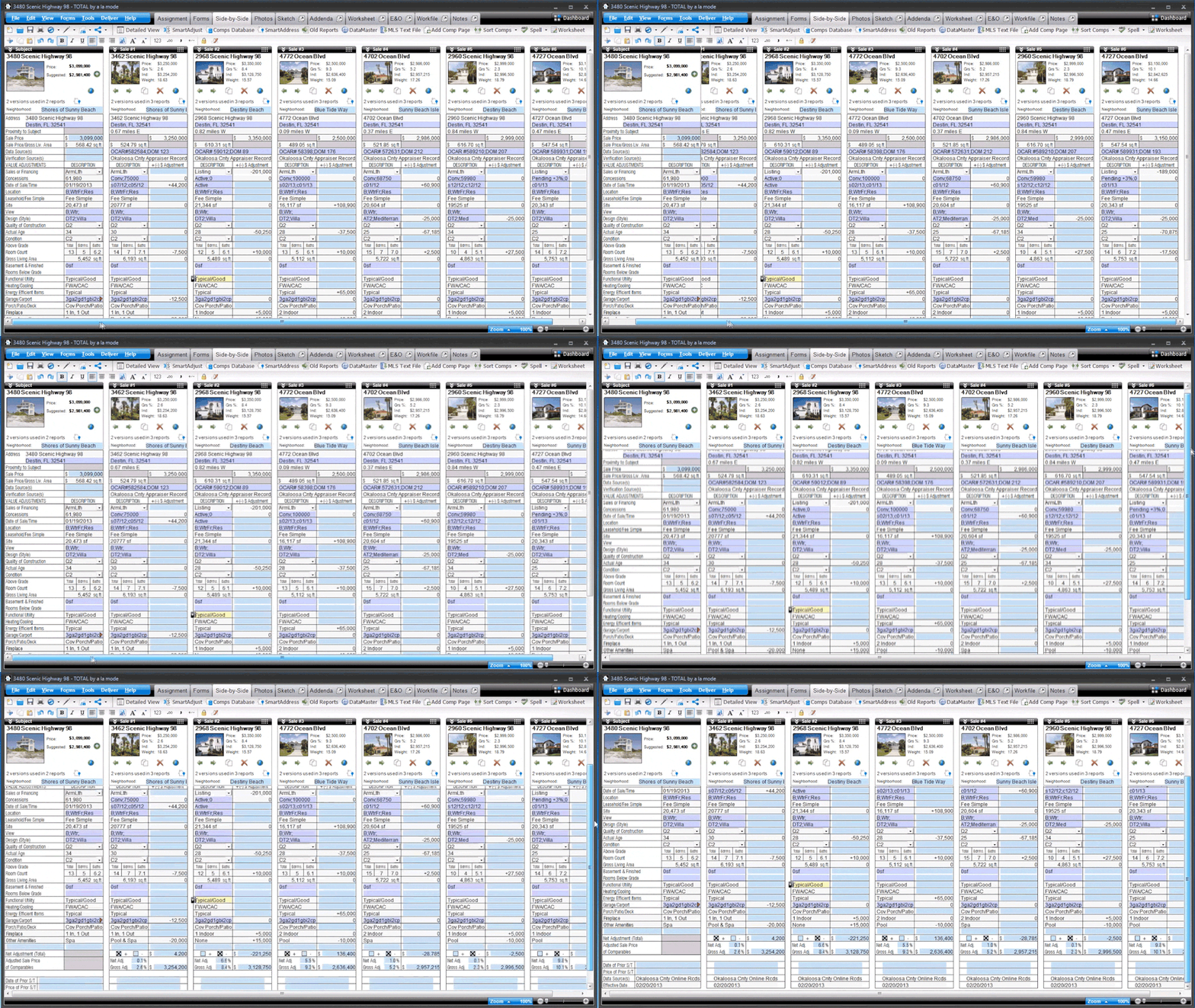
TOTAL’s Side-by-Side PowerView manages comps intelligently in one screen with photos and summary information for each property on top and each adjustment field perfectly aligned across the grid.
In ACI Report 2012, viewing your comps “side-by-side” just places two sales comparison forms next to each other on your screen. These two pages don’t line up across each item to be adjusted, don’t scroll together, and don’t display useful summary info or photos. It’s literally two pages "side by side.”

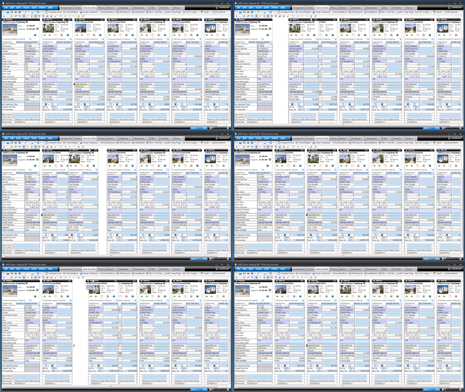
Once you’ve made some adjustments, you may need to sort or arrange your comps in a different order. In TOTAL, rearranging your comps is as simple as dragging and dropping them in place. Or, use our automatic sorting feature to arrange comps by fewest to most adjustments (or lots of other criteria).
In ACI, you’d fully re-arrange your comps by launching a new window. You're presented with a list of addresses and must use up and down arrows to change the order. Or you can swap two comps at a time with a shortcut key. Plus, without photos and data, it can mean a lot of guesswork to get it right.
Your software should reflect that you’re not simply a typist. We painstakingly designed our Comps PowerView to help you save time with every keystroke. And, we just scratched the surface of all that our Comps Side-by-Side PowerView can do.
More efficient comps management is just the beginning. You deserve the tools and features to get more work done in less time. Put TOTAL to the test on your next appraisal. Click here for a free trial or click here to set up a quick demonstration.



.png)



.png)
-1.png)

.png)
.png)
.png)
.png)
.jpg)
.png)
-1.png)


