Think of a time you’ve tried to pull a website up on your smartphone, and most of the site was off the screen. You pinched, scrolled, and zoomed to try to find what you were looking for, but the whole experience was frustrating. You may have even left the site and tried to find your information somewhere else.
That’s what happens when a website is not mobile friendly.
The opposite of that experience is a true mobile-friendly website, where buttons and text are large enough to see on any device, and the website design looks like it was made for a phone or tablet. Beyond giving website visitors a better experience, a mobile-friendly appraisal website design may even lead to more traffic and leads.
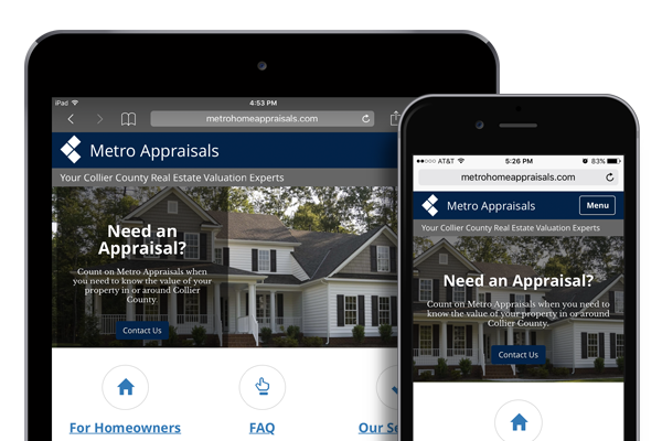
That’s why we’re introducing mobile-friendly designs for Appraiser XSites later this month.
Here are three reasons to consider going mobile-friendly:
1. More than 50% of web traffic comes from mobile devices
In 2014, mobile Internet traffic officially outpaced traditional desktop traffic to become the most popular way to search the Web. As more consumers purchase new tablets, smartphones, and smartwatches, this number will only continue to climb. You want your website to look its best on any device.
2. Google may penalize your site if it’s not mobile-friendly.
Over the last two years, Google has made significant changes to how websites are ranked in search results. Google is like any other business – they want to provide the best experience for their users. By ranking mobile-friendly websites higher in search results, they’re increasing the likelihood that people will find the information they need. Mobile-friendly sites also have a small "Mobile-friendly" label in search results from a mobile device.

If your appraisal website is mobile-friendly, you’re more likely to be ranked higher in Google for key search terms, which means more traffic to your website. And more traffic could result in more leads.
3. Mobile-friendly makes it easier for potential clients to get in touch.
On a non mobile-friendly website, important links like contact forms, e-mail addresses, and appraisal order forms may get buried at the bottom of a page. A visitor may head to your website seeking your contact information, yet not be able to find or click that information from their phone. If they get frustrated and visit someone else’s site, you might lose out on a hot lead.
Good news: We’ve made it easy to create a mobile-friendly appraiser website in minutes with our new Appraisal XSite designs.
If you’re an Elite Customer, or own an Enterprise Appraisal XSite, you’ll be able to upgrade your site at the end of this month (for free!) simply by logging in and choosing your new design. (We’ll keep you in the loop on when these are available.)
These upgraded, mobile-friendly Appraisal XSites will be available for just $299 for all other appraisers at the end of August. Click here to view a sample of our new XSite websites.


.png)



.png)
-1.png)

.png)
.png)
.png)
.png)
.jpg)
.png)
-1.png)


